top of page
In short
For the UX/WEB 2 module, we designed three prototypes targeting different user groups for an all-in-one platform managing schedules, homework, absences, and more. The goal was to create a collaborative workspace tailored to the school environment. This was my first major UX project, where I gained hands-on experience in UX research, information architecture, and wireframing. As the moderator for two user tests with teachers, I developed key skills in usability testing and user feedback analysis. The insights and experience gained from this project were invaluable for subsequent projects.
Tools
Figma (UI design & prototyping)
Slack (communication)
Notion (organization & project management)
Miro (ideation & collaboration)
Lookback (user testing & feedback)
Tasks

Desk research and analysis
UX architecture
User testing
Wireframing


Year
2024
Duration
3 Months
Team
Me
Lead architecture and testing
Fabio U.
Lead UI systems
Juliana N. A.
Lead UI design
Vivien v. B.
Lead UX writing
Yannic R.
Lead developer
Problem
With the increasing digitalization of education, new opportunities arise to enhance and innovate classroom experiences using devices like iPads. However, students are often faced with an overload of different apps that they need to download and use, which can create confusion and reduce usability. Additionally, many educational apps struggle to balance design preferences: children tend to favor playful, engaging interfaces, while adults often prefer clean, minimal designs.
Solution
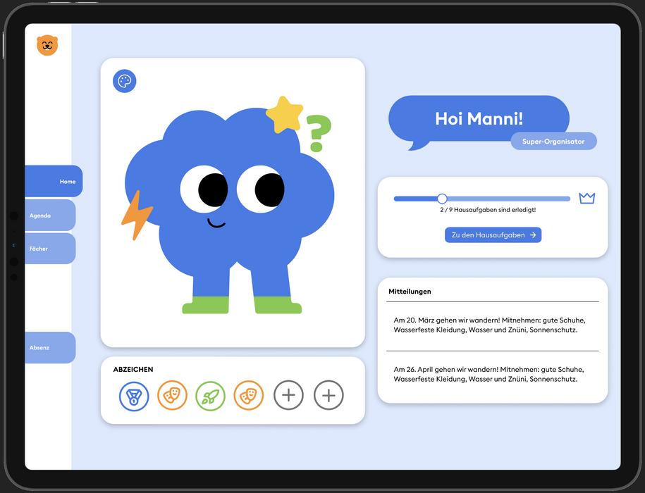
We designed an all-in-one app that combines homework management, schedules, study materials, student overviews, and absence reporting. To address differing user needs, we created two tailored interfaces: a playful, engaging design for children that allows them to customize an avatar for a personal connection, and a clean, minimal interface for adults that provides a clear overview with more detailed information.

Desk Research
We began our research process with Crazy 8s exercises to explore what features our platform should include. Early on, we identified the need for different overviews tailored to each user group: one for children, one for teachers, and one for parents. We then created personas for each group, with a particular focus on the child user. Based on these personas, we developed a user journey, conducted a competitor analysis, defined a design challenge, formulated “W” questions, and applied the AEIOU framework to guide our insights.
Persona pupil
Persona teacher


User journey pupil
.jpg)
Testing
We tested the low-fidelity prototype with two teachers using Lookback. The goal of the testing was to evaluate the user flow and identify potential areas of confusion. I acted as the moderator, while my team members took notes and documented observations. This was my first hands-on experience with usability testing, and I gained valuable insights from the process. We were only able to test with teachers, as regulations for testing with minors were more complex and advised against in our context.
Final Product Pupil
Final Product Teacher
More Projects
bottom of page


